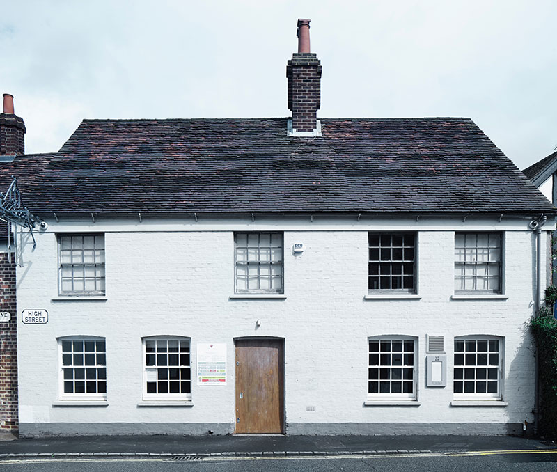
Little Chef Popham
Client: Little Chef and Heston Blumenthal
Location: Popham (followed by a UK roll out)
Year: 2008
Brief: to take part in a Channel 4 television series, documenting the transformation of a well-worn British roadside restaurant chain into a dynamic 21st century proposition by overhauling everything from interior design to graphics, menu and uniform, signage and packaging. Our involvement included art direction of all communication and merchandising.
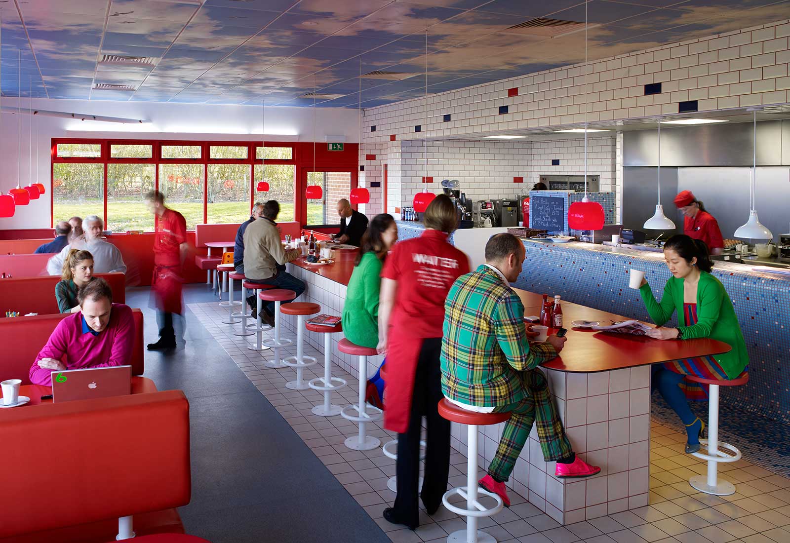
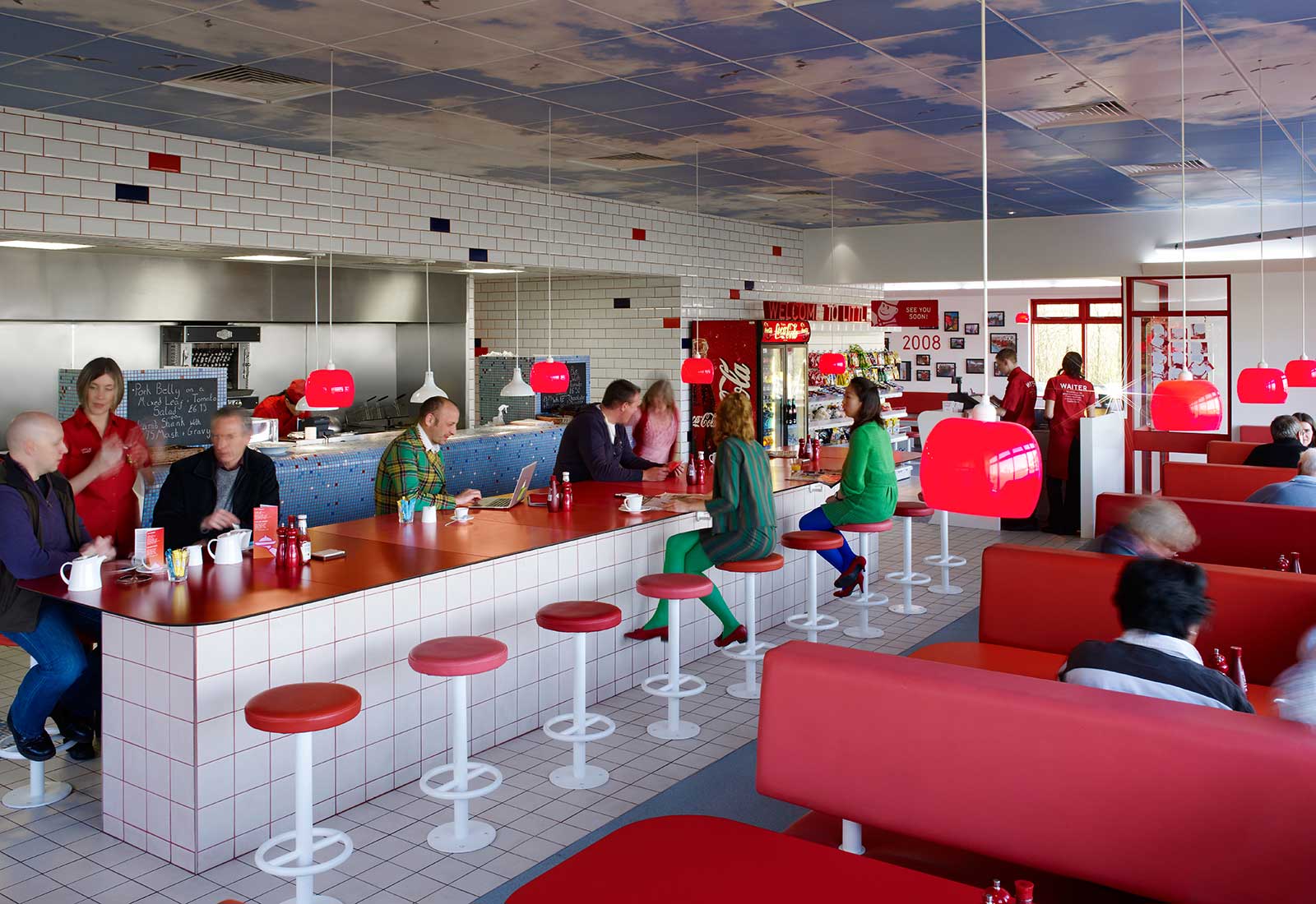
Our vision for Little Chef was to preserve the best of British tradition within a radically modern approach. The design needed to compliment the changes being made to the menu and service by superstar chef Heston Blumenthal while remaining loyal to the existing brand identity.
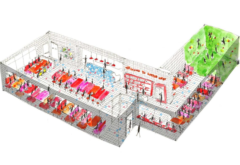
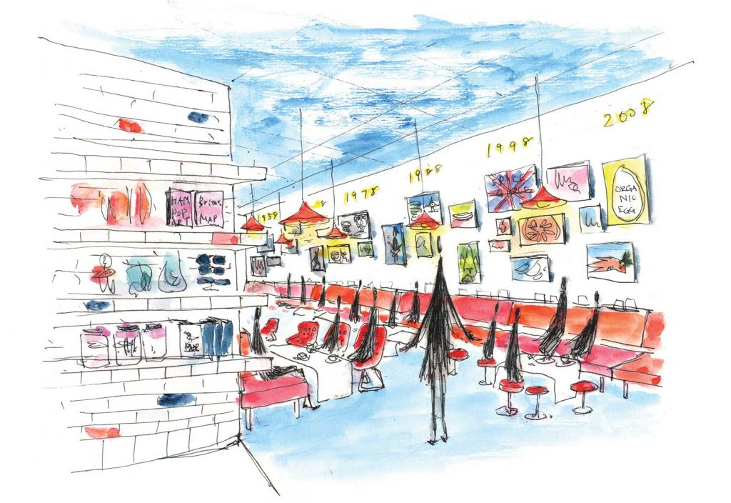
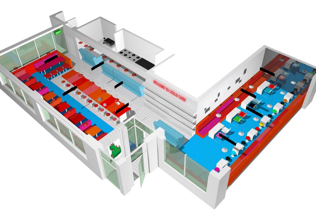
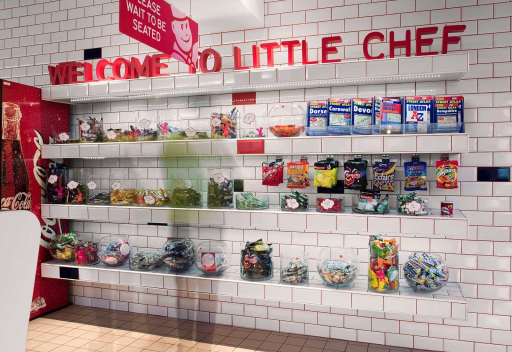
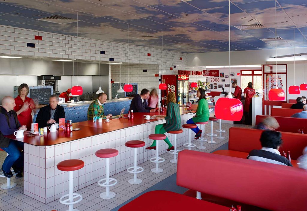
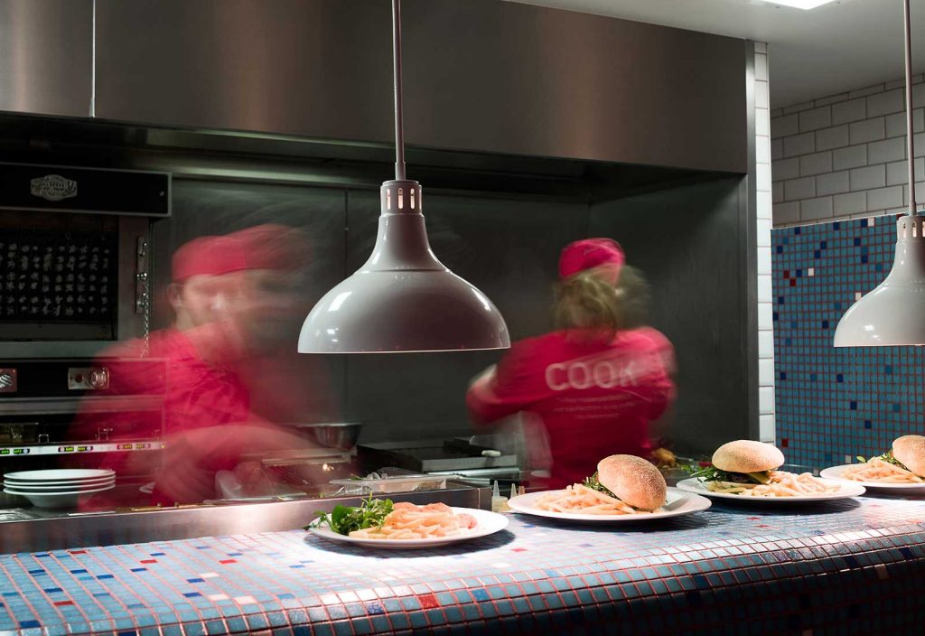
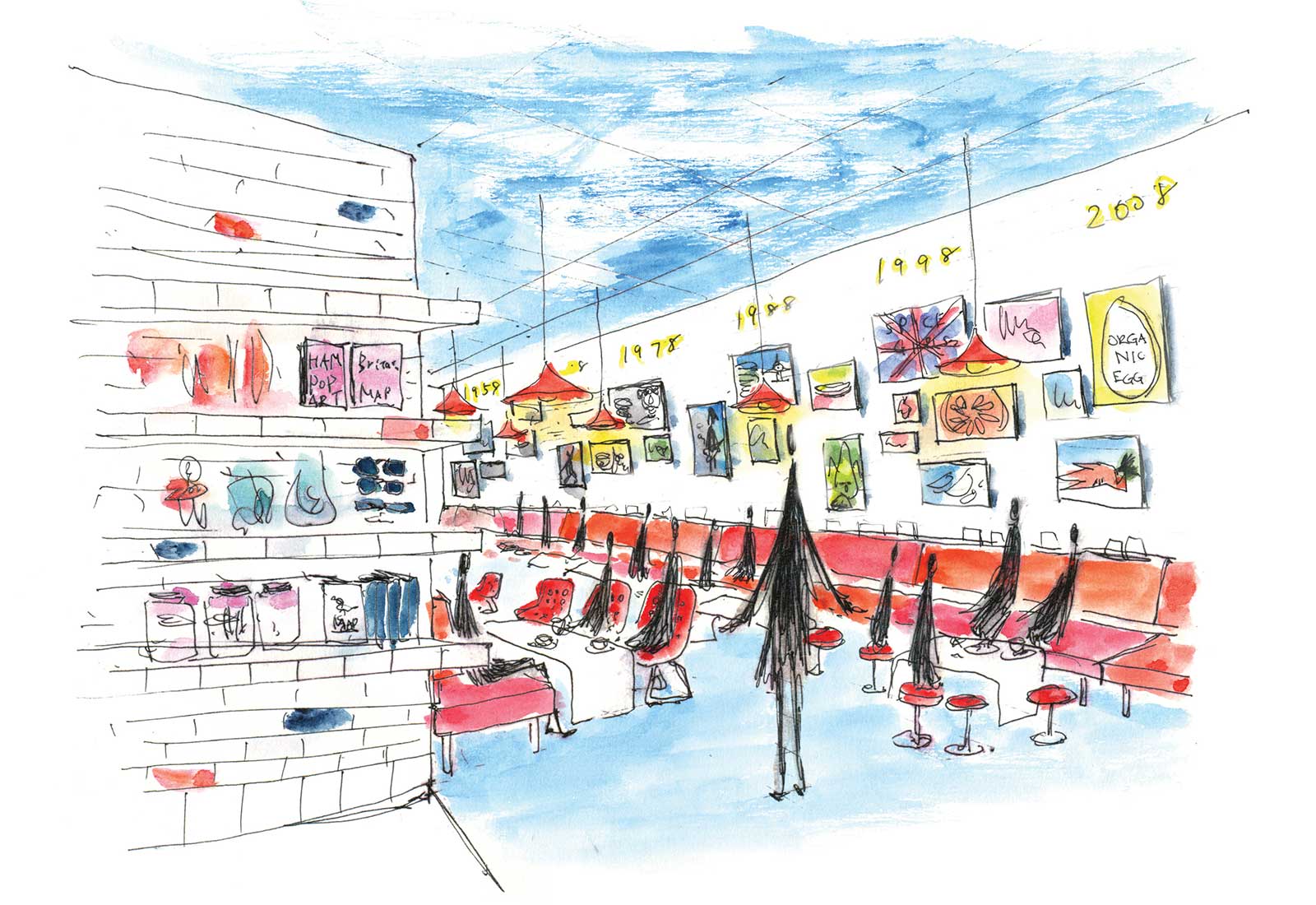
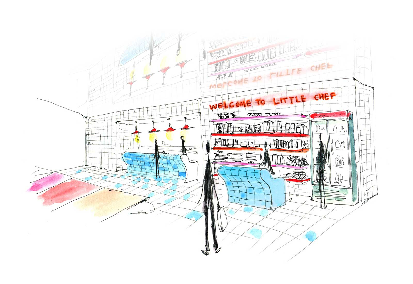
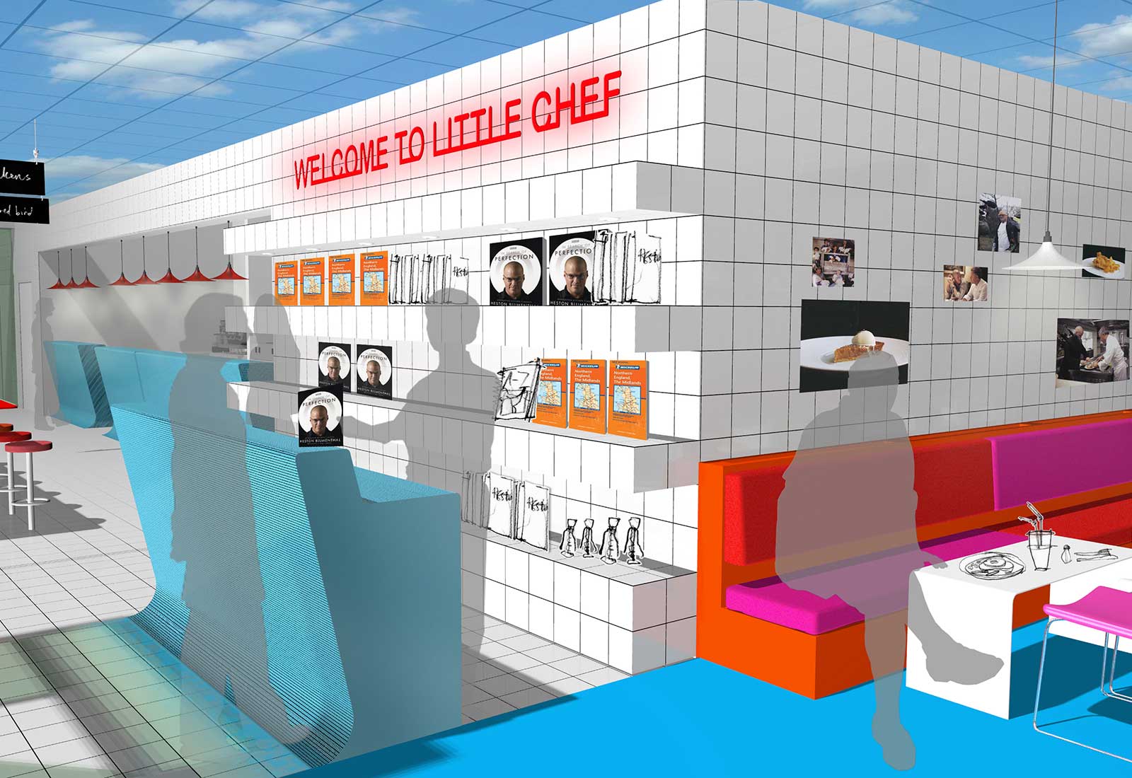
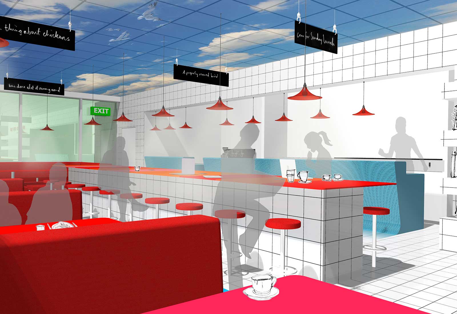
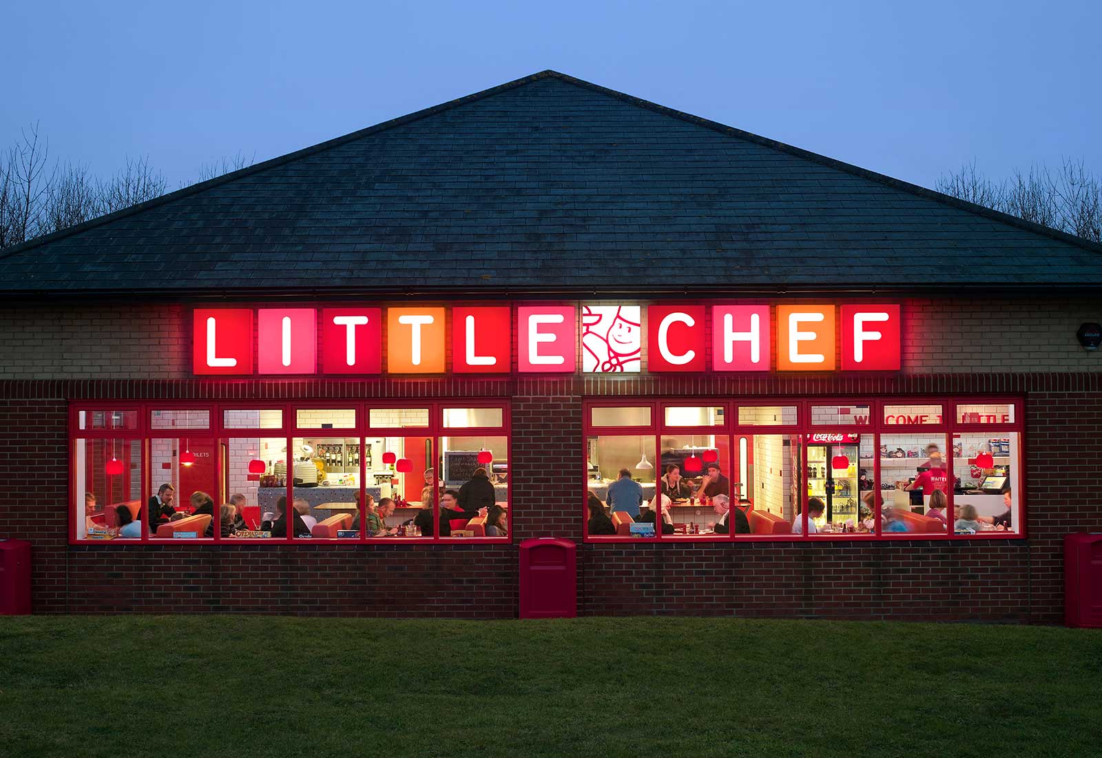
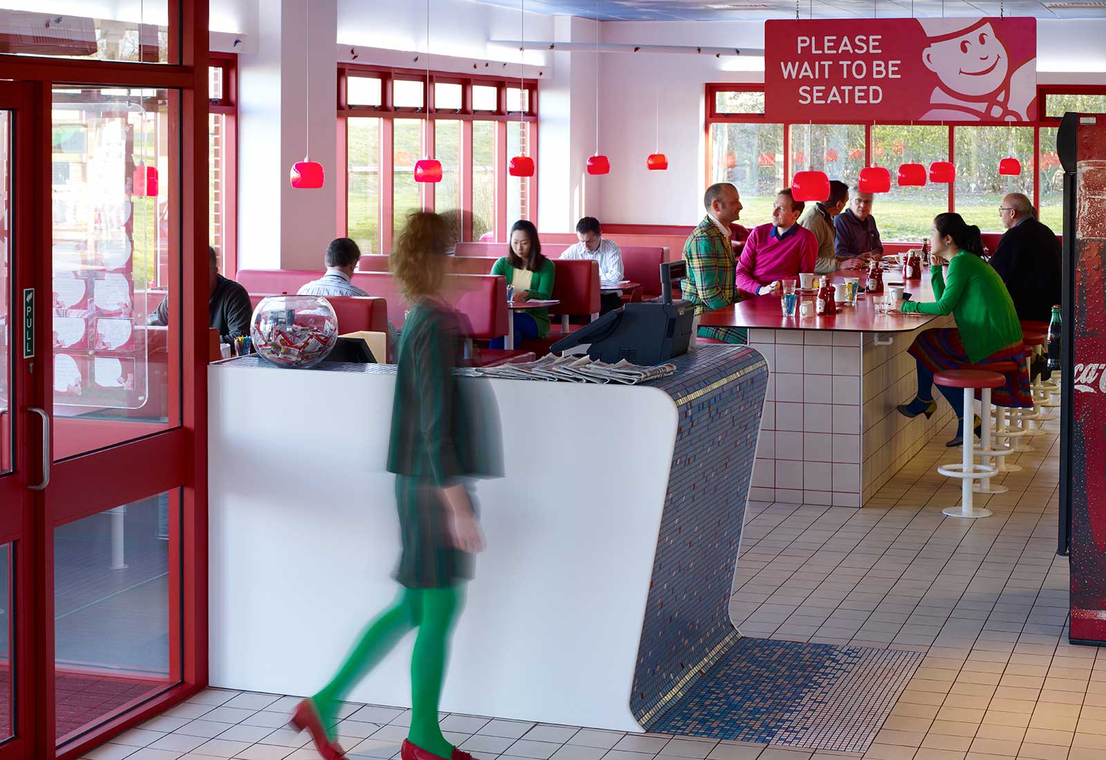
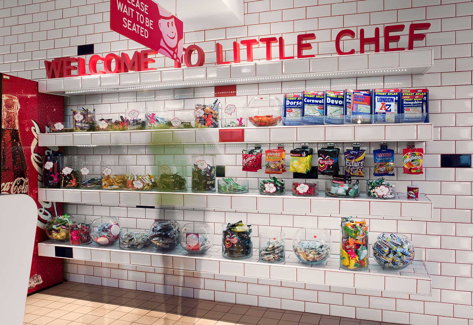
From the history of eel-and pie shops, traditional butchers and fry-up cafes, we took tiling and Formica, great for nostalgia, endurance and a feeling of hygiene, but then added vibrant colours, soft, flattering lighting and idiosyncratic details. Little Chef had historically been identified with the colour red, which we expanded into a full spectrum of possibilities from orange to pink. We re-orientated the entire experience around the kitchen, opening it up to the dining room and framing it with a mosaic tiled bar – in a contrasting blue – to create a colourful focal point, a hubbub of energy that spills out into the space.
Required to use ceiling tiles for technical reasons we saw the opportunity to make a virtue out of a necessity, printing them with a trompe l’oeil image of a blue sky with white fluffy clouds, creating a sense of airiness and evoking the freedom of the open road.
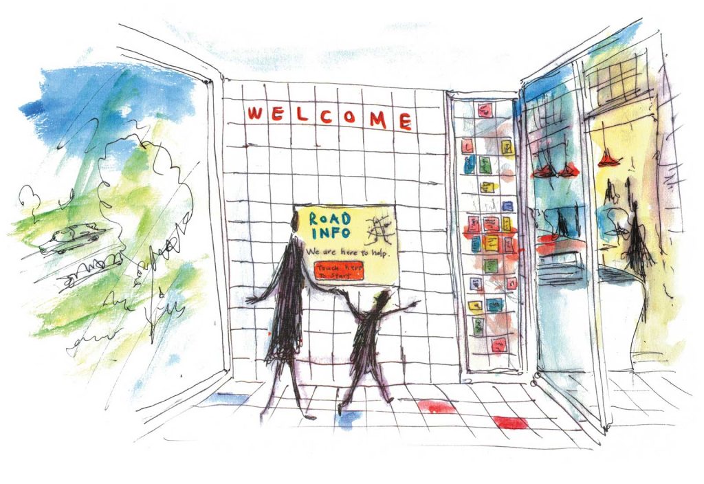
Other sensitive, playful design touches aimed at engaging a time pressed audience included food related quotes and messages printed on the tiles in the bathroom and interactive sounds or songs that played as visitors approached the urinals. To encourage those stopping quickly on route to extend their stay, we piped the smell of fresh coffee into the toilets as well as the inviting noises of a busy kitchen, evoking thoughts of comforting, traditional British food.
As part of our design brief we created a style guide, based on Popham, to be rolled out by the brand and ARD personally went on to design a further two sites with key elements going on to be rolled out further across the brands holdings.
Other sites:
York East
Kettering West


