JIKJI The Golden Seed
Client: Cheongju City
Location: Cheongju Arts Centre, South Korea
Year: 2016
Brief: Spatial design of an exhibition in celebration of metal type printing and its far-reaching influence on all the various forms of communication that have followed.
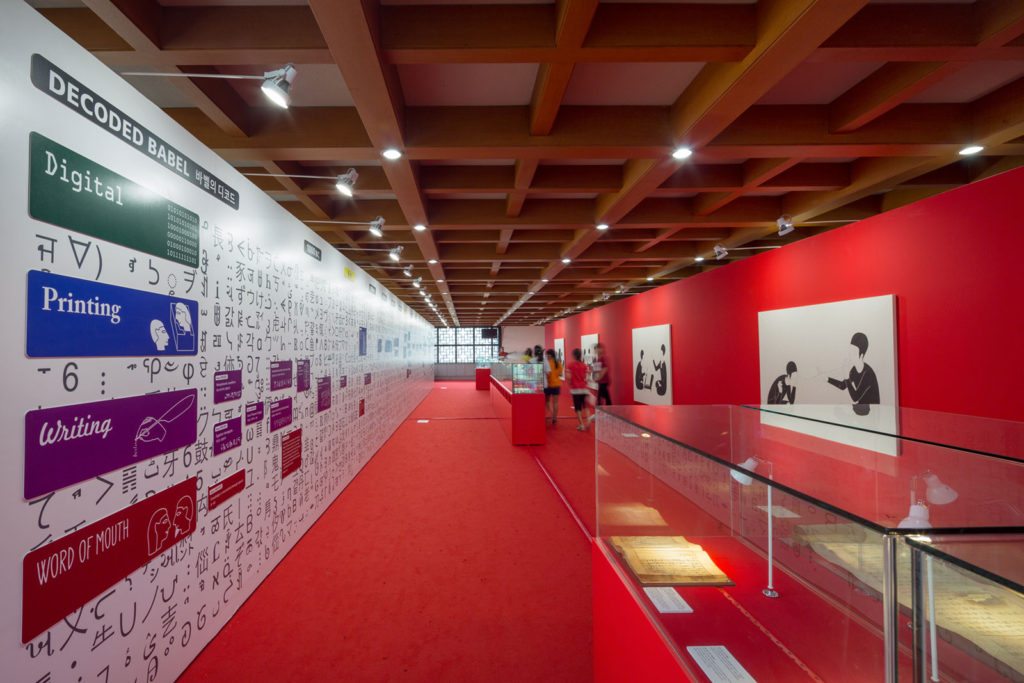
The Exhibition explored the history of human communication, from the spoken word to the digital revolution and beyond.
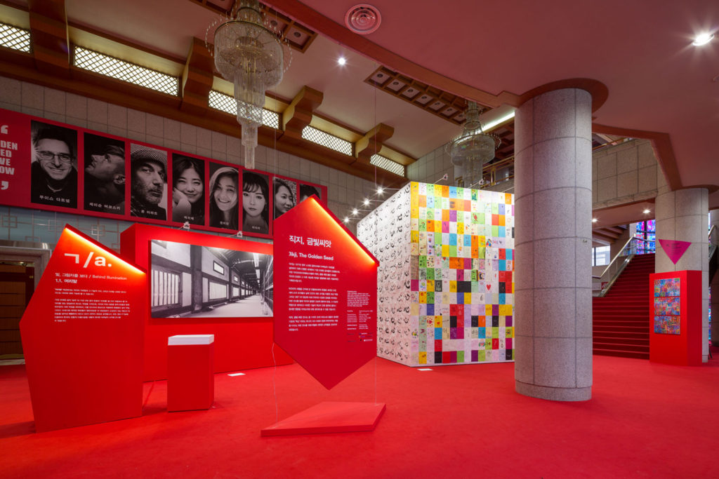
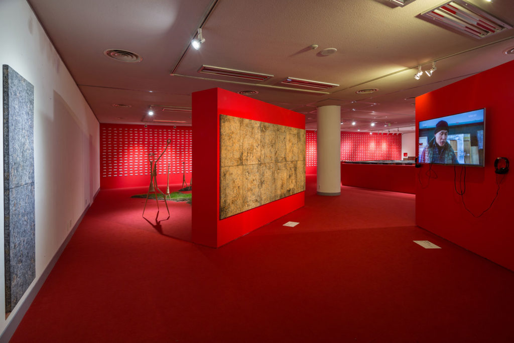
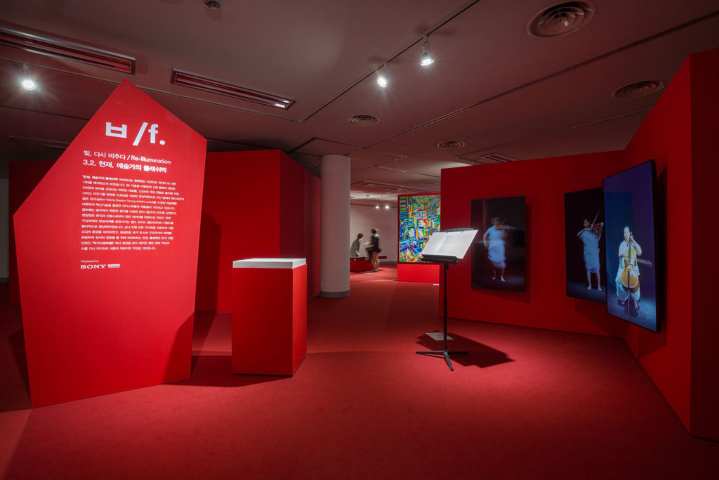
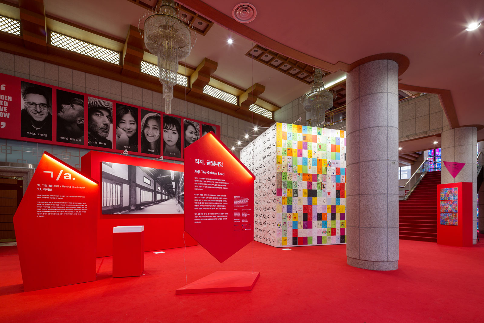
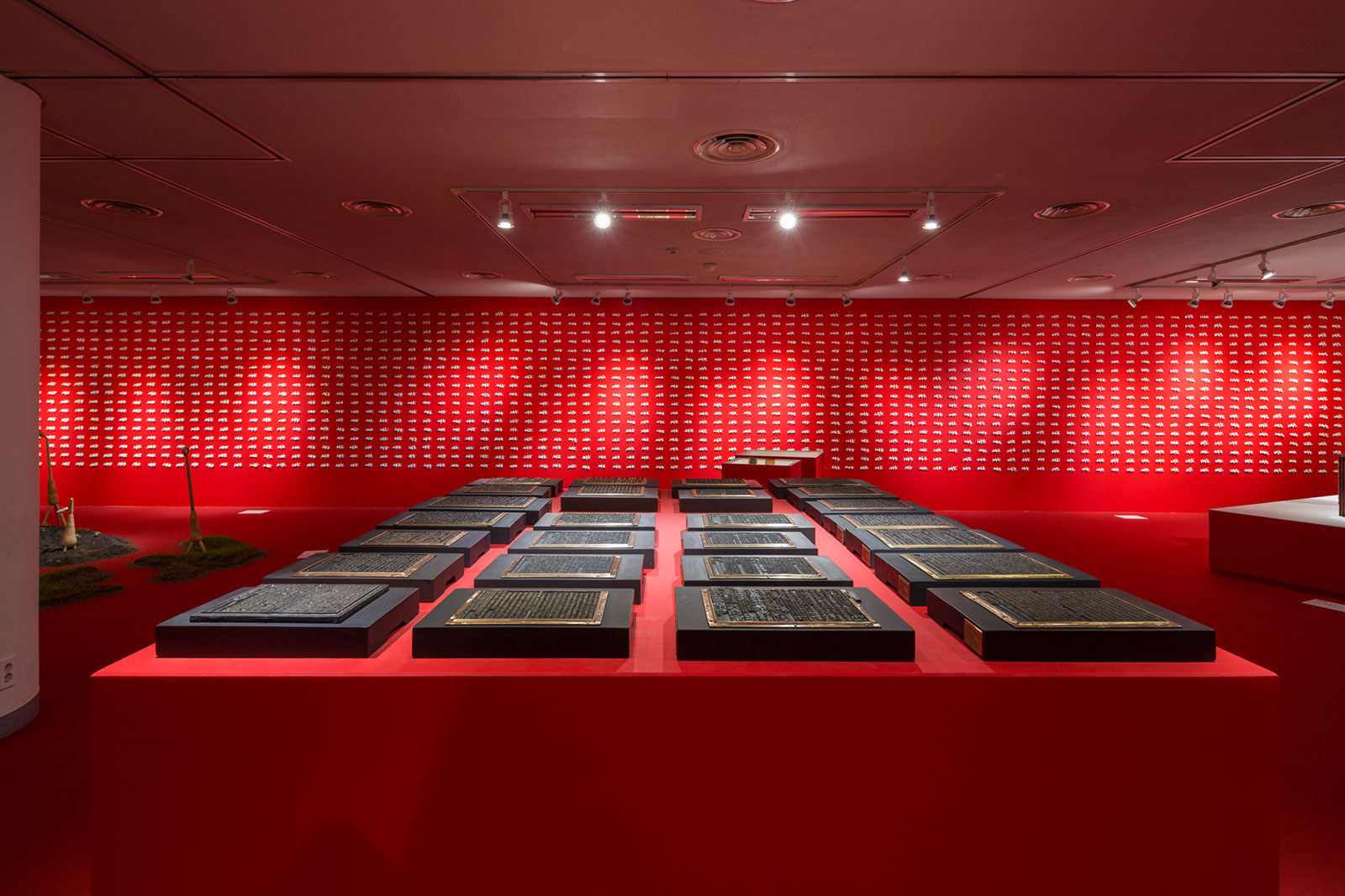
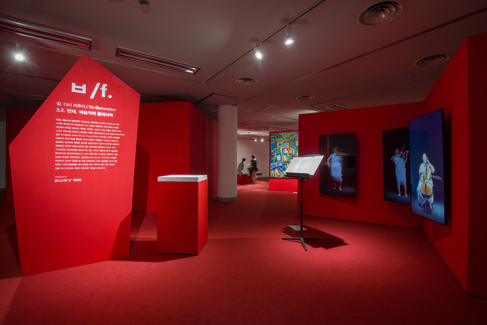
Content included historical artefacts and treasures along side contemporary digital inventions, painting and sculptures. Commissioned artists included: William Kentridge, Ron Arad, Choi Jeong Hwa, Ryoichi Kurokawa, Marshmallow Laser Feast, Leenam Lee, Kyuntack Hong. Significant historical objects displayed included the Gutenberg Printing Machine and the Guttenberg Bible.
The project had a limited construction budget vs site was an architecturally unremarkable municipal theatre built in the 1970s and our design needed to draw focus away from these surroundings, using dynamic physical interpretation and curation of the objects and art works to immerse the visitor in a memorable and engaging story.
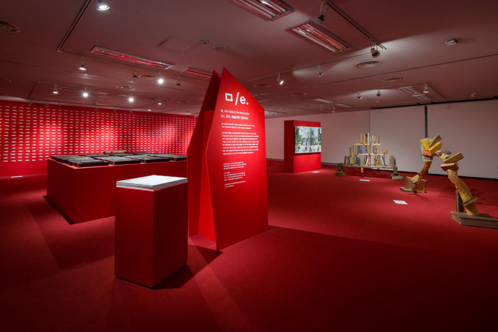
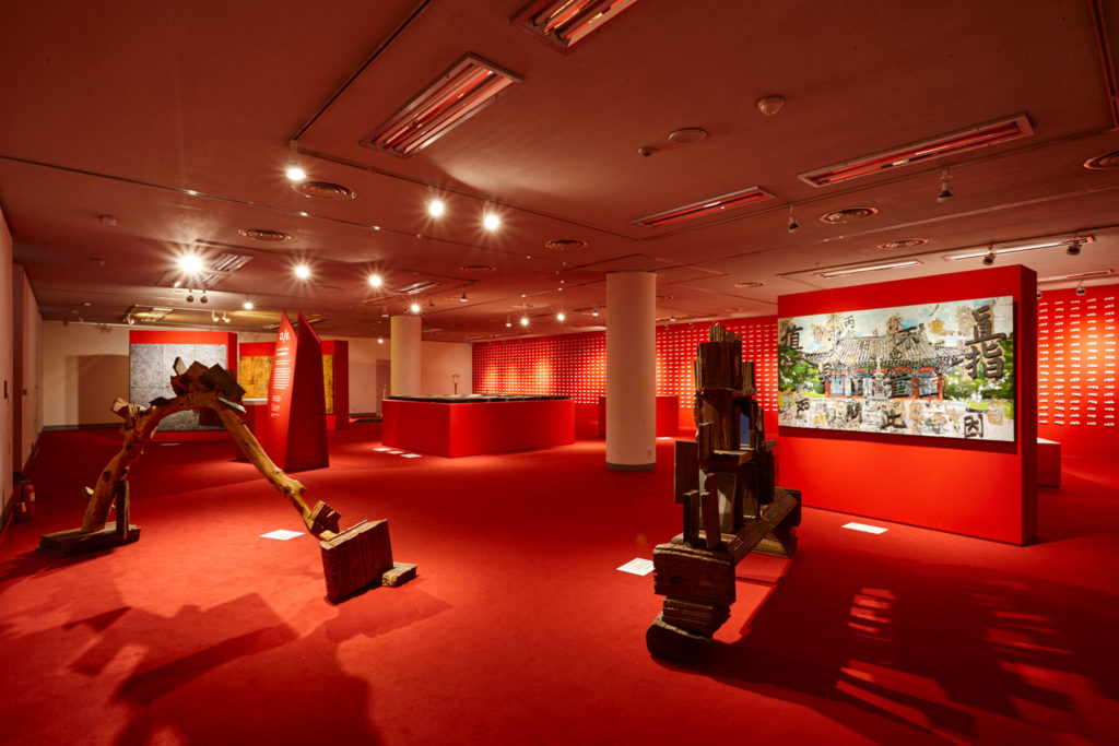
To achieve this we created a series of simple but striking display structures in a clear visual language that took inspiration from the works on show, creating a coherent landscape against which the narrative could unfold.
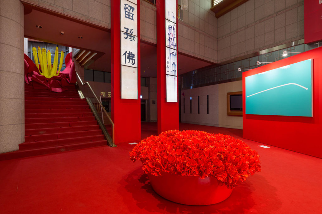
These structures were part of an approach in which we flooded the building with a layer of red. The provocative shade ran along floor and up any walls or structures that displayed content, wrapping around and uniting all the different elements while helping to support the curated flow of information and highlighting meaning and interpretation.
The specific red was chosen for its cultural ties to Korea as well as for its visual strength – equal to that of black – allure and drama. It was instrumental in our design, instantly transforming the space from an unused theatre to a gallery with an immersive, emotional quality.
The site presented a number of challenges, installing the exhibition in a non-gallery space with low ceilings meant that we needed to make the most of the available floor space to hold graphics, support orientational interventions and hold content displays while allowing tactile exploration of the red that tied each element together. A wave of rich red carpet announced your arrival in the exhibition and carried you forward, arresting red graphics informed you of what was taking place all around you, eye catching totems clearly explained each zone and floor based captions described the details of each individual project.
-(8)")
-(14)")
-(34)")
-(94)")
-(30)")
-(32)")
-(25)")
-(44)")
